Have any of you found yourselves dipping your toes, or perhaps I should say rather, your hooks, into the Lily Pond Blanket Crochet-Along designed by Jane Crowfoot, in conjunction with Stylecraft Yarns?
There is something very appealing about the idea of replicating a lily pond with a hook and yarn and I am afraid I just couldn't resist the notion. It's an entrancing project to work on, as the Spring shifts towards early summer and my own little garden pond beckons. Have a look here for the free pattern instalments and details of Jane's exquisite design. Jane's blog has some extra, and very helpful, notes here, if you're interested.
The blanket is designed to be hooked in Stylecraft Life yarn which is an acrylic / wool mix yarn in a fabulous range of colours. You can buy special packs for the project from Deramores and you can pre-order Stylecraft Life packs from Janie Crow here. I think there have been some supply problems with the Stylecraft Life but Deramores do a Stylecraft Special version, pretty close to the original pack.
But here I came face to face with a snag, caused, not by supply problems, but by my own prejudices and / or fussiness. I know this is a heresy in the hooky-blogging sphere and I may get disapproval / criticism for "letting the side down" and saying that "the emperor has no clothes on", but I generally don't like making blankets from yarn whose predominant fibre is acrylic - I find a lot of it is quite scratchy and not very nice to work with. There are exceptions, of course, as with everything, but generally speaking.
This is, quite frankly, a big, old nuisance as predominantly acrylic yarn is far cheaper; it tends to come in nice, fat balls, not 50g tiddlers you have to keep replenishing, and the colour ranges in something like Stylecraft Special, are, without question, first class. I've tried using it, but I always reach the same conclusion a few rows into whatever project it is - I don't like the feel of the finished fabric; I am not all that keen on the look of the yarn itself; and I don't much like working with it, to the extent that the sensation and sound of the run of it, down my hook, can set my teeth on edge. And if I am going to invest a good many hours in a project, I don't want to work with something that puts my teeth on edge all the time, or to end up with something that I don't like touching or looking at in the light. However cheap the yarn may be, or however extensive the colour range.
I know there are very many people who love it and who get wonderful results from using it, but it just doesn't work for me, so in the first instance I thought the Lily Pond blanket would have to be shelved as a nice idea, but not practicable to realise. While wandering along Deramores' virtual shelves, however, and humming and hawing about whether I could put aside my aversion to acrylic scratchiness, I found they also offer a version of the Lily Pond CAL colours in Stylecraft Classique Cotton. This is a pure cotton yarn, un-mercerised and soft; it is a dream to work with and while the colour range is not as comprehensive as its acrylic-based Stylecraft siblings, it's nonetheless good and not too far from the palette required for the blanket. Aha!
So far, so good, especially as I had quite a few of the required colours in my stash and didn't have to buy the whole pack. But it wasn't quite as straightforward to make the switch to a different yarn, from that recommended in the design, as I'd hoped. The length of yarn in each ball is considerably shorter, for a start, so you need more balls of the Classique Cotton than the number specified in the pattern for the Life. Probably two, for each one of the main colours (the greens and teal at least). And the colours in the two ranges although similar, are far from identical. The suggested substitution of the pale blue "Sky Blue" (Classique) for "Mint" (Life), for example, just didn't work for me. I tried replacing it with the deeper and greener, "Tropical Jade" (Classique Cotton) but this had the effect of unexpectedly bringing out the yellow component in the other greens ("Leaf" and "Soft Lime" in the Classique Cotton) and gave the whole panel a most off-putting, sickly, yellowish tinge. The kind of colour, reminiscent of stagnant water, full of unspeakable sludge and suppurating duck-weed, that has been sitting in the sun without any refreshment of rain, for some weeks in a dry summer, and from which a heavy and unpleasant odour assails you, if you approach too close. Nasty! Certainly not what I wanted to replicate in my throw which I wanted to evoke a cool, clear, limpid pool into which you might, on a hot day, feel tempted to dip your feet. A few frogs and fish in there perhaps, to tickle your toes, but no rotting pond-sludge or decomposing waterweed, thank you!
In the end I have substituted the dark blue "Nocturne" in the Classique Cotton for the pale bluey-green Life "Mint" which is quite a bold swap as the two colours are quite different. It works though, I think. I much prefer it to the "Sky Blue" or the "Tropical Jade" anyway.
The pattern is being released at fortnightly intervals. The third instalment was released today. It's a lovely way of doing it, as you never face too much at any one time and so it feels nice and manageable. Of course you don't have to complete each stage in the first fortnight of its release, but if you want to, it's been well judged in terms of what it asks, I think.
In the first instalment you make part of the pond - rippling stripes of greens and blues to represent the water. Among the first few rows there are flecks of colour - to represent the goldfish swimming among the depths and perhaps the waterlily roots. I love the idea of that. The bright flick of a tail, caught by the sunlight through the water, before it disappears into the cool, dark shadows. So evocative. But here I've made another swap. The pattern instructs you to use pink for the flecks of colour which is fine for representing reddish waterlily roots, or budding leaves perhaps, but I'd got stuck on the idea of the goldfish and have you ever seen a pink goldfish? No. Me neither, so the pink had to go and orange "Seville" has replaced it. I am conscious that this also is a bold swap (which may backfire on me) because potentially I may have disturbed the harmony and equilibrium of the overall blanket by introducing a rogue colour element. Orange features nowhere in the rest of the design and it may stand out like a sore thumb, if I am not careful, sparing though the flecks of orange are. I may have to add a judicious hint of orange to some of the flower centres, perhaps. We'll see. Too early to tell as yet. But in a strange way these slightly unexpected colour conundrums are making the creative journey of the blanket not stressful, but rather exciting. Unpredictable, but alive, if you see what I mean.
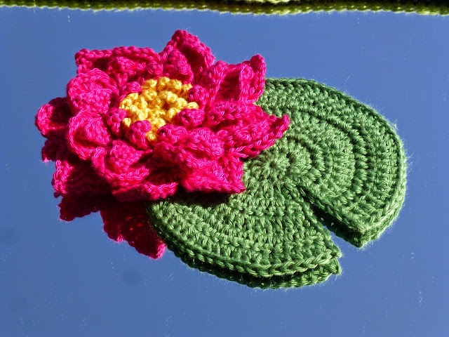
I was so taken with the water panels I thought I'd make a waterlily to sit among them just for the sake of it. This isn't part of the CAL blanket but is a most beautiful three-dimensional design by Esther Chandler of Make My Day Creative. You can find her free pattern here.
I've made this in Cascade Ultra Pima mercerised cotton in "Pink Sapphire" and "Buttercup". The pad I made up myself and is in Cascade Ultra Pima "Sprout". I took the water and the waterlily with its pad outside to photograph on a mirror under the big cherry tree currently in bloom in the garden and I love the effect of the deep-blue, Spring sky and the foamy, white blossom reflected alongside my hooky efforts.
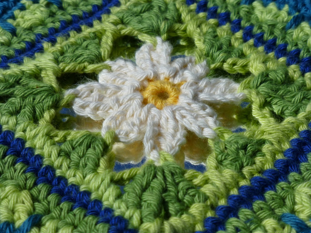
The second instalment of the pattern was for the first batch of lily-bud squares - I haven't quite finished these. They need some surface stitching in deep pink to highlight the petals.
But I love the way the frame-work, that surrounds the flower in each square, has a slightly lacy, fragile quality to it, while the outer rows are quite solid for joining to the other panels.
Today's instalment is for another version of the lily-bud square with a slightly bigger, more open flower. I am looking forward to starting it very much.
Has anyone else embarked on this project and made any creative adjustments? Do share, if you have. I find that part of creativity, and reading accounts of others' experience of it, fascinating.
E x


